Category: Final Major Project


Submission Edit

This is my submission edit for the FMP module. I am really not happy about handing in this edit, in fact im quite embarrassed about handing in such a week and half finished piece.

Screen shot 2013-05-09 at 09.03.45

Through out the project I wasn’t sure what to call my animation, I thought of words like ,chagrin, meaning a keen feeling of mental unease, as of annoyance or embarrassment, caused by failure, disappointment, or a disconcerting event. Vexation, a source of irritation or annoyance, sounds good but didn’t work with the animation  A had never heard of those words until i got my thesaurus out and that made me wonder how many others would have heard of them so I passed on those. As the animation was set in germany i had used the german word for recording light, it hadn’t occurred to me to use Aufnahme as the title of the animation  It made scene, its a german word so it suggest its german and even if the audience doesn’t understand what it means at the start i think when the record light switches on in the animation they will understand then. Also the purpose of the experiment is to ‘record’ the data coming from the subject.

I dont like the title effect, it was done very quickly, its simple and boring and I can do a lot better, just the clock was counting down. I added the flicker to give a sense that something is being switched on like the recording light later in the animation. The same with the credits at the end. What I would like to do for end of year show is ask someone in our second year if they would like to do a really nice, fancy title and credits, while I finish creating the 4 minute version of the animation.

Screen shot 2013-05-09 at 09.05.01

The first shot would have been a lot more effective with the wires stretched across the screen like i had originally intended. What I didn’t want from the first shot is for the audience to make out what it was they were seeing until another shot later on. I just wanted the audience to take in the shapes and the atmosphere and hope fully build a curiosity about what that figure is in the room. I think the lighting in the shot is nice, it sets the tone for the rest of the animation. There is some really bad masking noticeable approximately 10 seconds in, thats due to my messy render layers where I missed turing of the primary visibility on the roof on a pass.

I think the scene is too still, it feels very flat. I think some very slight movement on my character would have broken that stillness also maybe some particles floating around to give the room depth.

Screen shot 2013-05-09 at 09.05.26

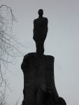
This shot is intended to inform the audience that somebody is observing what is going on inside the room. It would have been nice to get a human shadow on the wall to make it a bit clearer and suggest that there is actually someone there. I tried animating the camera as if it were through the eyes of the scientist, peering through the window.

Again there is some ugly masking, due to messy render layers and it is quite noticeable at approx. 0.22. There is a moving shadow above the window frame that shouldn’t be there.

Screen shot 2013-05-09 at 09.05.44

I think this is a really nice shot of the microphones. The lighting and depth of field really puts an emphasis on what I want the viewer to be looking at. The humming suggests they are on and ready to record something. I added some particle effects in-between the wall layer and mic layer to give the effect of space between the two, I think that works really nicely. Overall I think its a really nice asset.

Screen shot 2013-05-09 at 09.06.00

This is the first time you really see my character, it was also the first render I saw of her myself and I was shocked at how good it looked. It made me realise just how far I have come in 3 years and that I can produce CGI to a relatively high standard and I am proud of that.

I wanted this shot to give the feeling of her waking up or coming alive after being docile for a long period. I also wanted it to be quite a key scene in introducing her to the audience as there are no close ups of her previously.

I really like it, i think it feels like she is waking up with a shock, like she’s tired and incoherent. The lighting has some really nice shadow on her face and having the window in the back ground coming in and out of focus keeps this suggestion that she is being watched. The frame rate seems to drop slightly when she leans back out of the shot, thats because i slowed the clip down. the animation seemed to fast, you didn’t have a chance to look at her before she disappeared from the shot again. I could have done with rendering out a slower animation, but thats something i can consider amending.

The displacement map looks good, but i could have done with some more marks, pores and wrinkles on her face, she looks a bit too smooth.

Screen shot 2013-05-09 at 09.06.29

I think this was a nice shot from the scientist perspective of what it is they are seeing. It could have done with being longer, its over very quickly also there is no transition between her being curled over backwards to her being up right. That was simply because i didn’t have a render of her becoming upright again. I could have added it to this shot, seeing her become upright and begin to move. The music also comes in to quickly, there is no build up in this version and i can not stress enough that that is NOT down to the music producer, I edited it like that for the submission edit. The full version and potential of the music, complete with build up, will be used for the end of year show.

The walls are a bit dark and could do with a slight beam of light to give emphasis on the character.

Screen shot 2013-05-09 at 09.06.50

The speakers could do with a vibration effect to give them the impression they are on and give them a more intimidating feel. There is also some masking issues, the walls and speakers were rendered out as one layer and thought the walls were fine, the speakers needed lightening and the only way I could do that was using a mask.

Screen shot 2013-05-09 at 09.07.02

I was concerned about the length of such a static shot when rendering this one out, but after keying a pull focus effect using the camera lens blur it kept the image moving even though it was a static shot. I also like the framing, I would have liked the microphone further left in the shot but because of their placement of the other assets it wouldn’t be possible with out physically moving it.

Screen shot 2013-05-09 at 09.07.34

I really like the scream shots, I think they quite un nerving and really change up the tone of the animation. I would have liked a lot more emotion in her face, some pain would have been really effective, but because i only had her eyebrows and mouth animated i was quite restricted to what I could depict. This augments didnt work so well, so I tried not to put to much focus on them and chose the better shots of them. At certain points they would disappear into the body mesh because of the animation. I suppose this is down to the practicality of it, the augments are hard surface so they dont deform with the flesh, so im going to get some ugly overlapping. I should have taken that more into consideration and it would have been better to have them as soft organic mesh and keep the illusion of hard surface. This way the bending wouldn’t have been so noticeable on the hard surface augments as the overlapping is. I did however render out the augments on a separate layer so they could sit over the character layer, that eliminated some of the problem shots.

Untitled-1


I noticed when i was editing this wide rotation shot what sometimes the record light and window would disappear for a few frames. I’m really not sure why it did that, the only thing i can think of is that i have accidentally key framed the visibility or a few frames have been dropped on that layers image sequence. Its not major, it just looks like the light is short circuiting, but it is annoying though because once you spot it that seems to be all you can focus on. For some of these rotational shots i reversed the clip to play backwards and it would give her an odd unnatural movement an i thought that was a good effect.

Screen shot 2013-05-09 at 09.09.03

Through out the animation there is an inconsistency in lighting, it changes levels of brightness throughout. for some of the shots i have to turn up the brightness on the wall so much that they looked washed out and faded. I could have avoided this if i didn’t tamper with the lighting from shot to shot. thinking about it now it was a really silly thing to do, but the reasoning behind it was to light the assets for the shots. Next time i’ll light the scene and lock them. There should have only been one light change and that was for the shot above, when it is supposed to be the sun coming round and shedding warmth onto the character for a moment of comfort, relief and pleasure. The shot seems to be a bit to orange, i could have done with toning down the levels a bit, to get a more natural light effect.


As a piece I feel it is very rushed and i tried to squash a 4 minute story into 2.30. It works, but it doesn’t work fantastically. I’m just glad i have a finished piece of sorts to had in that is within my statement of intent deliverables.

However, below is the rough draft of what I intend to produce for the end of year show. The story makes more sense, it has a beginning, middle and end. There is a switch in the tone of the music which brings a variation in dance and shot edit. Its coming along and i think what will really set it of is the sound effects. So watch  this space, full version will be coming end of June.

Sculpture Park

To get some inspiration i went to the Yorkshire Sculpture Park with a friend fromt the course. I wasnt really sure what to expect or if i would find anything useful. but it is suprising where you can find influence. In the gallary there was an exhibition by Yinka Shonibare and he had was a film on show that was quite mesmerizing  there was something strange abou the movements of the dancers that I couldn’t put my finger on, until I saw the fabric moving in the wrong direction to the body. It was all being played backwards and that give it this strange looking almost creepy movements. Something I will be taking advantage of to give mine that creep factor.

Unfortunately I couldn’t find a link with it being played backwards. but you can use your imagination.

We saw some great stuff there some of which resembled limb less humanoids.

I chose to do an a short animation as it seemed a good way to show off and use almost all my skills I have learnt over the course. It plays to my strengths and shows my modelling, texturing skills and reflects my artistic style. I think I have a really good human model! better than i thought which just shows i will only get better with time. It shows I can do environment modeling as well. Above all i think it shows imagination, that i try to be different and some times a bit controversial, if you want to get noticed, sometimes you need to think outside the box I seem to have some good texturing skills when it somes to realistic textures, i just need perfect bump mapping as some bump maps dont seem quite right. There is a massive amount I have learnt, about myself and my capabilities. Also what aspects i need to work on, especially my file organisation and render management, that aspect does seem to be all over the place, which only held me up in the long run.

As always I try to do everything myself and for such a big project I think I could have used a hand to make it look great in the space of time we had to do it and to the high quality I wanted it.

Although I didn’t get done what i wanted to i am quite proud at what i have achieved so far. I will just have to keep working on it till end of year show.

I read a story about a BBC children’s tv presenter who has one arm getting some awful responses from the audience. comments and complaints to the BBC were made that she was scaring the children because of her disability.  I grew up with people with disabilities  so i have never seen the disabled as anything other than human. But it just goes to show that even in this day and age there still is an incredibly high amount of discrimination.

It does make me consider my character and the audience’s reaction.

Taking my character design into 3D i had to make some slight changes in considerations for animation and other aspects. Things seem more materialistic in 3D. In my 2D design I had a fair few steps leading up the back of the boduim, i reduced that to 3 believable steps, believable in hight.

I also didnt pin the leather to all the steps. I would have needed a lot of polys to do that and i was trying not to go crazy on the count. I just pulled in the leather as much as i could. There was going to be no real close up so it made sense.

I left of the belts joining the cradle to the stand. I figured that the belts would stretch excessively when the cradle would move with the animation so i left them out.

I had concerns about modeling  the corset cord and making holes in the mesh for the eyelets. Sometimes the simplest answers are overlooked. The cord was made by extruding a nurb circle along a CV curve, something i hadn’t done before, but was so quick and easy,  tool that will come in really handy in the future  As for the eyelets, i didn’t need to make hole in the mesh. The camera isnt going to be close enough to see there isnt actual holes in the leather. Rayrace shadow create that illusion for me.

I think i have created a really nice detailed object, with some basic texturing and bump maps i think it looks great.

podium_in

Taking influence from several sources, the disables statues Mark Quinn etc. I have come up with a character that is tamer than I had expected.

I wanted something really deformed and strange. Something like what you would see on resident evil and silent hill. Something like this sketch i drew.

skecth010


but ended up with something looking very human and would appeal to more audiences.

I decided on nudity for venerability, that she has been stripped of everything and left in this cold dark place. I wanted to keep her fairly flat chested as I feel large breasts would have distracted the audience from what else was going on in the scene. I think it would have brought a sexual aspect to it and that wasn’t what i wanted to achieve.

In terms of the rest of the body, i started off wanting quite a twisted ‘ creature’ but as development panned out she became more human and people sympathise more with human characters because they can relate to them. I think I would have been limiting my audience if I made it to dark.

frt


I watched fascinating documentary on channel 4 , How to build a Bionic Man. I am so interested in things like this, replacing part of the body with augmentations. It is something of science fiction that is and in some areas has become a reality. But what I am trying to stay away from is robotics and more biological augmentation. In this documentary there is a penitent who has had his heart replaced with a bionic heart. This is a similar concept that I want in my character, she has had augmentations implanted not organic in nature for the purpose of experimentation.

http://www.channel4.com/programmes/how-to-build-a-bionic-man/4od

Storyboard

IMG_0290

I have commandeered a pin board in the mez, to put up my work and organise my storybard. Which has been quite handy, its easy to switch around shots and  also, I used it to show Dom, my sound guy, the ideas and give him an idea of what it will pan out like.

Storyboard

p1 p2 p3


Reflection

Looking back now, wish i had done a full anamatic, but i was unsure what angles i was going to shoot for the dance until i saw it. But having seen the dance now, it wouldn’t have made a difference, i could have set the cameras up and chosen what angles i wanted and see how much I had to render. Instead after i did the planed shots you see in the storyboard I have been winging it if im honest, which meant i was rushing it because the dead line was getting closer.  Im lucky it turned out the way it did, half decent.

Not to self… NEVER do an animation or short film again with out an anamatic. I could have saved so much time and stres if I did and the result would have been a lot better.

Tacking out sections of my statement of intent I will reflect on the thing I said I would do.

Screen shot 2013-05-07 at 18.26.06

I have not based the story on the physically and mentally disabled but largely influenced on periods when physically and mentally disabled people where largely discriminated against. I think I  felt I need some moral reason to do this piece and make a statement but what is actual is is the story of what my character is going through and what she is, based on past discrimination of the disabled.

Screen shot 2013-05-07 at 18.34.39

I think i used the wrong word in this, narrative should have been narration.

I was concerned if my editing would be upto this, but feedback from my final Crit confirmed that the audience could follow the story without any narration. They understood what was going on and commented on emotional responses they experienced for my character.

Screen shot 2013-05-07 at 18.53.47

Because of the emotional responses of the mature audience in the final crit, it reinforces the fact that my animation is for the maturer audience. Taking a look at the BBFC it seems my animation falls into the 15 category as there is nudity.

http://www.bbfc.co.uk/what-classification/15

Screen shot 2013-05-07 at 19.02.30

Im in no illusion that my character is photorealistic, but i gave it a good go. The character is the most realistic i have done so far and not just in modeling but in texturing also. There are so many aspects that go into making something photorealistic, i could spend a whole module on it. But i think i achieved a style of realism, in the fact that she is a believable living entity.

Screen shot 2013-05-07 at 19.11.04

I did out source a dancer , use IPI soft and apply it to my character. I am very pleased i did as she was able to give me the flexibility in the character that i had imagined.

Screen shot 2013-05-07 at 19.13.28

That meeting was successful and Dom has created the music and foley will be added before the end of year show.

The deliverables as stated are:

Between 2.5 and 5 minute animation exported as 1920 x 1080.

I do have an animation within that boundary, just not 100 complete or with sound

Music Duration

For a while now, people have been saying your animation is to long. I asked Dom, to try and cut it shorter. I suggested a spot that I thought might work and sent an email to him and he came back to me with about 2o seconds cut out. It might not seem a lot but in animation and rendering times, it is quite a big chunk. Thats over 500 frames times that by 4 for all the render layers I would need and that over 2000 frames removed from the work load. It has made it a bit more manageable. It is a shame it needed to be cut but sometimes these things have to be done to make things work especially in film and moving image. I personally don’t think it takes away from the track, it still works.