Category: Visual Language


A bit about my final pieces

I have dabbled in Photoshop but never explored it as much until now. I have surprised myself with how much I did know and how much I have learnt in the past couple of weeks.

For my first image, Don’t blame the games, I chose an issue that I have found myself in several debates about, Children and video game violence. In my poster I wanted to state that adults and parents are buying 18 rated games for under 18’s and that they are responsible for monitoring what their children watch and play. Certificates are there to protect the younger generation. I think my poster puts that point across using minimal text and the rest said though image. You can see the mother with the money, the father smiling and the child wide eyed and taking in the images. I chose three images from games that have strong violence to represent the 18 certificate. Overall I am very pleased with the outcome of this poster.

For my second poster, Moderation, I thought about making an image with influence from Hannah Hoch and Richard Hamilton. I took influence from Hannah Hoch by taking photos and roughly cutting them out and the black and white and colours are an influence from Richard Hamilton. Although  I am not a huge fan of either artists I wanted to look at this module as an opportunity to experiment with Photoshop and imagery. This isn’t my favourite poster I have done but I am pleased I experimented with this style, it showed me that images don’t have to look realistic and polished to get a point across.

My last image, The question of man, was a late thought. The image just popped in my head an I thought I could use it as quick addition to this project. The idea is my favourite one, it is simple, powerful and effective. It has a John Heartfield, one image reading as two, style and the simplicity of Peter Kennard. I would like to develop this idea a lot further, I can see it as a short  moving image and would really like to experiment with this idea. It represents the ultimate question, what is the meaning of life?, what is mans purpose? Why are we here?

Overall I have really enjoyed this project, discovering new techniques and expressing my imagination and ideas.

My presentation

Hybrid

I had never used power point before and it was very easy to use. I found it quite simple to put together a power point, it is the actual presenting it that is the hard part for me. Although i knew everyone there and most had seen my final image i still got incredibly nervous. I had a few notes to hand to help me remember points I wanted to get across, but ended up forgetting that i had them in my hand.

This stage fright is something I need to deal with, i’m ok with one a one on one but as soon as it becomes a group I get a dry mouth and mix up words and say the wrong ones.

My actual presentation I felt was simple, not overpowering and to the point, not many transition effects or fancy shading.

My feed back on my final image was to in add more fungi, produce a turn around and to add something for a sense of scale. All if which i have taken on board and do.

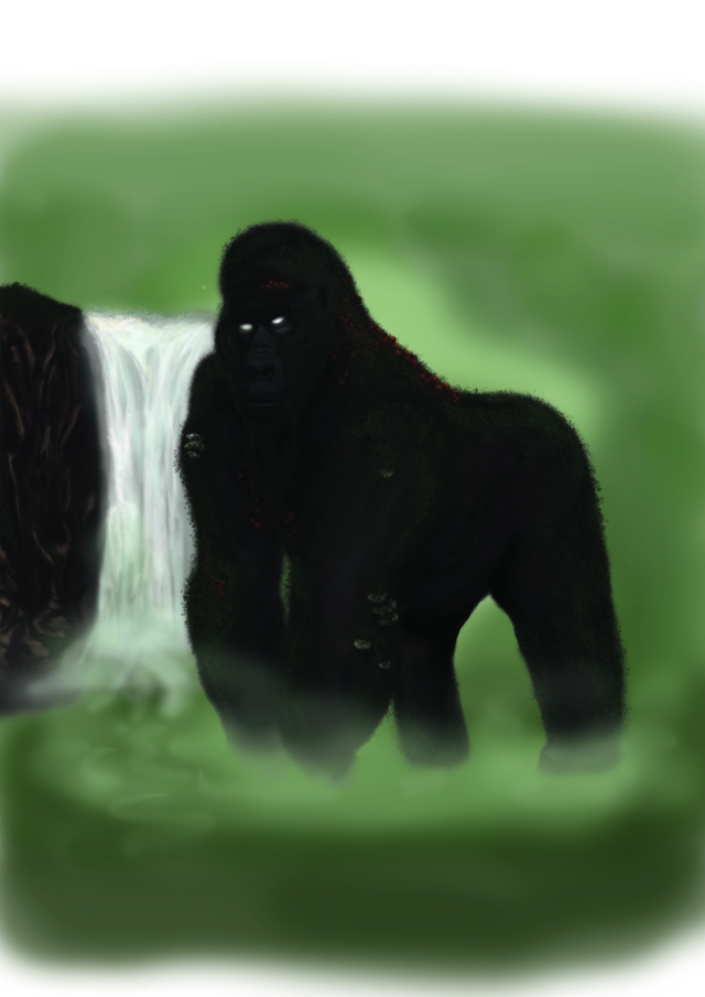
I am so pleased with the way my Giant forest red back has turned out. I have never achieved something to this quality in Photoshop before. I can see how my new skills i have learnt crossed with tips and feedback from my fellow class mates has considerably improved my skills.

As this brief was about the process I took several screen shots over the course of creating my image, to show the gradual develpement and put the shots onto a time line.

My Giant Forest Red Back.I chose the name as it resembles that of the silver back gorilla. I used red back because of the red fungi that grows on his back.

I received some feed back after my power point presentation to the class. Suggestions to add more fungi to his back, as i have called him red back it needs to be more prominent feature. Also to place something in there for scale. This was something I had planned to do from the start. I wanted to put a damp green forest background, with a waterfall and trees to portray his sence of scale. Due to the impending deadline I have had to come away from the idea of a background and asked to produce a turn around.

I was very concerned about the viability of my image. I had been working on my laptop at home and duels screening on my tv. The image looked fine and detailed but when i viewed it on my laptop screen it became very dark and lost a lot of detail. So i took the file onto the college computers and it was still very dark. So in order to present my image i increased the brightness and contrast and increased the green in the color balance to make sure the detail of the moss could be seen.

At the beginning of this module i used sketch books for most briefs. but not this one, i decided to try and use my blog and used a pencil and paper very little. Again i am trying to do as everyone else instead of using what works for me. I think if i had used a sketch book i would have skectched more and probibly developed my image further.

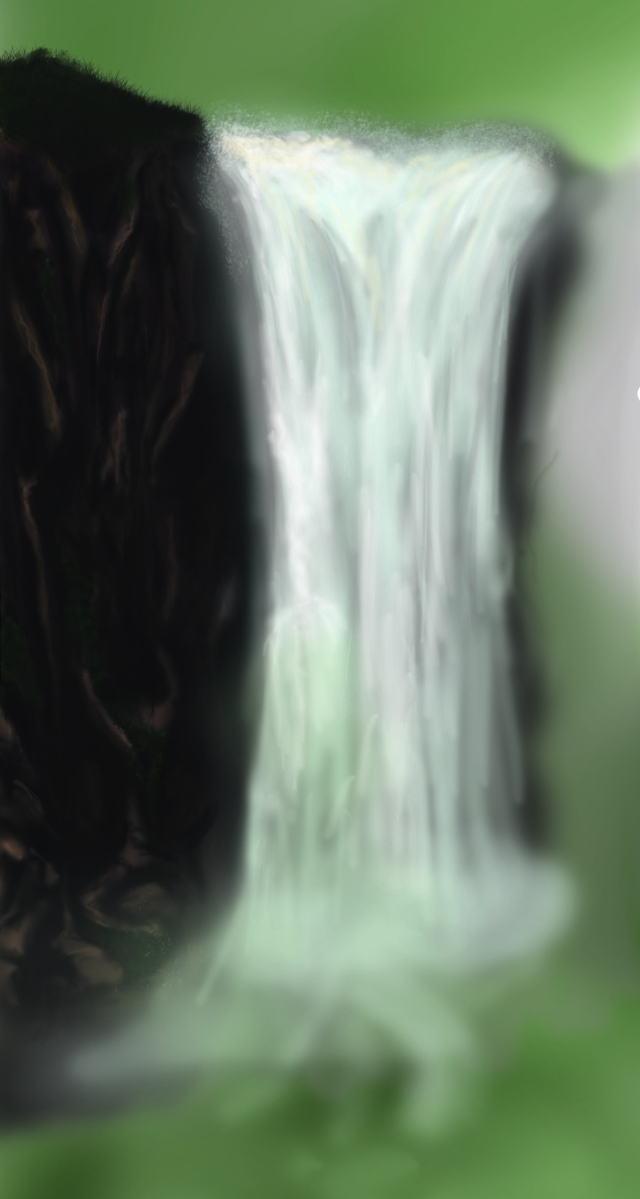
Thinking about where my character lives i wanted to produce a full rendered image of him and his environment.Although i had already began to do my background unfortunatly due to time it is not going to be possible to finish. however i do plan to continue with the background at a later date.

I looked in one of my books from home called Natural Wounders of the world by DR.Adrian Glover. In it are some fantastic landscape and land formations. I used three of them for refferance and inspiration to draw my background.

Iguacu Falls, Brazil

I used this picture for referance of the water fall. Looking at how the water isnt just white, there are shades of yellow and lavander in there too. The mist reaches quite high up the waters fall and vapor sprays out the sides.

Mount Sabinyo

I used this image to help with the texture of the moss on my hybrids back. Also helped me with the different shades of greens. The Rocky cliffs in my background would also have trases of moss.

Angel Falls, Venezuela

I used angel falls to referance the rock and how holiage would grown on the clif side. Also it helps me with the rock texture and colors.

The start of my background

Prosses, my hybrid.

From my brain storm the most appealing combination for me to explore is the monkey and fungi. I began thinking how I could combine the two. When I think of fungi I think of them in greeny, brown colors, growing in, on and among. My favorite style of characters are those of a colossal nature. To create a visual realistic colossal being is something I want to achieve. So I’m gonna do it for this brief. I am going to create a colossal gorilla with mossy fur and fungi growing on his back , elbows etc, I imagine him in tones of greens and browns, like he is part of the forest, some mythical creature that is rarely seen. What I don’t want is it to be compared to King Kong, I want to make it clear King Kong was no influence on my design. One of my influence is actually the ps2 game Shadow of the Colossus. These Characters are giant beasts made from flesh and rock.

I like the colors of the colossi on the third image, forest colors, colors I intend to apply to my own image. I will be producing my image in photoshop and developing my idea in Photoshop. For reference material I have been looking at gorillas.

This is my initial sketch of my idea combining the words monkey and fungi.


Ive placed the tree and person in there to give a sense of scale. I like the idea of having birds circling as its and image you see around tall cliffs. The fungi wont be incredibly obvious but will add a reddish color to the greens and browns of the creature. Looking at my fungi mood board the smaller pebble like fungi will be added to his elbows, shoulders and rump. I want to include a few fungi with the longer stems but not sure how they would look, so will try this in Photoshop. Ill give him mossy fur and a few dreads.


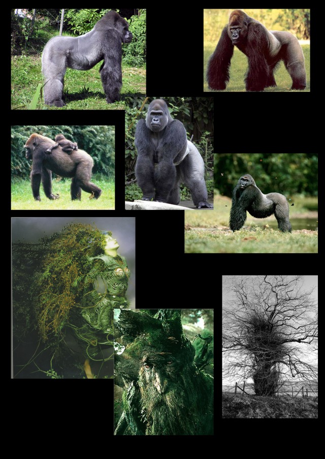
My hybrid mood board

I chose to base my design on a gorilla as they have great prominent and strong image. Their arms are like branches, thick and powerful. There is also a distinct and deep curve in their spine, like the sheer weight is putting pressure on their spine.

Facial and body sketch produced in Photoshop…. It is a rough sketch and something I will amend as my creature develops. He will have a few dreads coming off his chin and I had the idea of birds cleaning around his ears, something you see birds doing in the wild. Also you often see images of gorillas and monkey enjoying being groomed by fellow monkeys and gorillas. I really want the eyes to look different to a normal gorillas, in human if you like. I think by doing this it would totally change the way people would perceive this image. Instead of seeing a green monkey with fungi growing on him, they would look at it as a creature of fantasy or myth, as if magic was in his veins.

I am super happy with the way my image is coming on. I’ve stopped saying I can’t and proving to myself that I can. I have also stopped comparing work to other peoples and started to draw how I know how to draw not how everyone else is drawing. Although illustrator is useful for some things like the pen tool, I feel it gives a solid cartoon look to everything which is not what i want. So I wont be using illustrator at all for this brief.


Tetsuya Nomura

I am a huge huge fan of the final fantasy series, it is the reason I am on this course. There is something about the style of animation that makes the hairs on my arms stand on end. Everything looks beautiful, the characters are all stunning androgynous beings, the clothes incredibly inventive and unique just something about the whole style that draws me into the world of fantasy.

I am eagerly awaiting the release of Final Fantasy XIII Versus. Every time I watch this trailer I get so excited I want to jump around the room.

The man responsible for this stunning imagery is Tetsuya Nomura.

Character Designer and Game Director for Square Enix Japan has previously directed and worked on more than eleven Final Fantasy titles and is continuing to work on new ones. I find his work has a seamless flow and characters, for example in Final Fantasy X, all compliment each other, in style shape or color.http://squarehaven.com/people/Tetsuya-Nomura/

Final Fantasy X

This slideshow requires JavaScript.

My favorite of Tetsuya’s designs are the ones for final fantasy X. They are full of bright vivid colors, creative costume designs and creative creatures (summons). Images i would replicate when i was younger. His landscape designs are smokey and dream like.

I am looking forward to seeing what future designs Tetsuya Nomura has in store.


Build

Looking at other set design models

This is a design for a movie set. looks like its made out of wood. It looks very professional and substantial.

Wow what an incredible model! This is beautifully intricate. It shows you both inside and outside and has lights. This must have taken months to do. Its painted and gives you a clear understanding of layout.

To keep costs down I will be making mine out of card. It will be Nomiki’s main base of work at Rosso’s Command Center on the first floor. The building will be round and clinical and have a mathematical feel to it.

My model

For the build brief I have chosen Nomiki’s work place, Rosso’s Security Headquarters. I will be building a model of the first floor where Nomiki works when she is not out on patrol. From this room Rosso’s security personnel can view the cities statistics and observe and communicate to personnel on patrol any law braking or problems on the city streets.

Interior

I want the base of operations to feel, technologically advanced, dark but still lit with bright lights. Like the image below.

I like the curvature of the image below, the way it seems to swoop around.
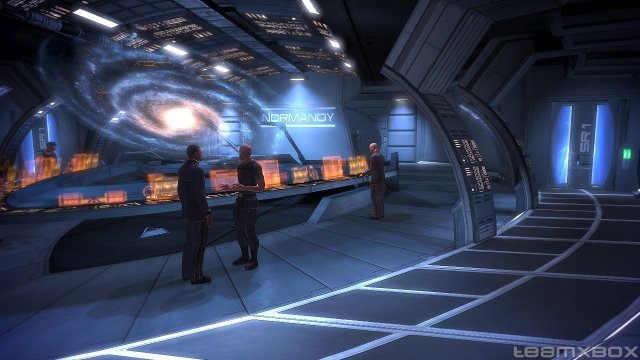
The most obvious technological base of operations I could think of was the decks of Star treck space ships. When i imagine Nomiki and her colleges working, this is the type of technology I imagine. Touch screens and lit up dashboards.
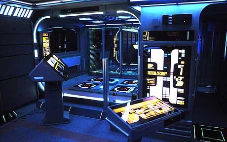
I like the idea of a huge screen of information on either side of the base, being controlled by the Rosso employees from control panels underneath. The purpose of the big screen is so the first in command can observe the goings on in the city.


Although all these concept images are of some kind of space ship they still represent the type of feel I want. Clinical, futuristic full of monitors and information.
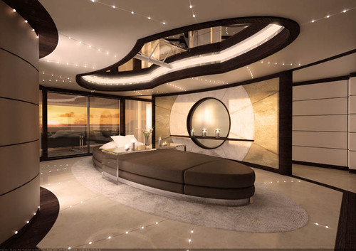
I imagine all the consoles, elevations and seats to me some, spherical and curved. this desk stood out because of the shape and the color is similar to the roof of the base. I intend to make the chairs the same color as the Headquarters roof, to make a link with the exterior and interior and to keep the red ( rosso ) theme running.

My sketch of the interior.

Thumbnail sketch of the center podium console overlooking the large screen, with smaller chairs and consoles in the background. On the top right a very rough shape of the room from a bird’s eye view. Bottom right a profile sketch of someone sitting in the chair at the console. It just give a feel of the room. I will import this image in to Illustrator and Photoshop to tidy it up, develop and color.

Concept art Rosso’s security headquarters

Having got a Bamboo Wacom graphics tablet for Christmas I decided to take pen to plastic and free hand my building for my character to inhabit. I knew I wanted an organic shape and something that would stand out and to continue the red theme. I took inspiration from one of my favorite concept artists, Tetsuya Nomura. I looked at ships and buildings from FFX and FFXII. His work has an organic feel and large curvatures in the design.


Final Fantasy XII

This ship from Final Fantasy XII almost looks like a creature, a dragon flying through the sky.

Final Fantasy X
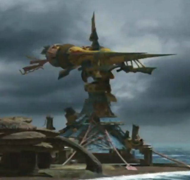
I could not find an image of this machina weapon so had to take a screen shot from a movie clip of the FMV. A like the sharp peaks of the two cannons either on side, like icicle shards.

This is called the mechanical Circus, the sky ship from final fantasy. I really like the pastel colors used grand and royal. It looks like Tetsuya Nomura uses lots of free handed swooping strokes and I think it’s that that gives an organic shape.

Having got a Bambo Wacom graphics tablet for Christmas I decided to take pen to plastic and free handed my building. I knew I wanted a organic shape and something that would stand out and to continue the red theme. I continued to develop and work into it over the Christmas holidays. I did get frustrated with it and one point and posted it on our DFGA page, to ask for feed back and suggestions.
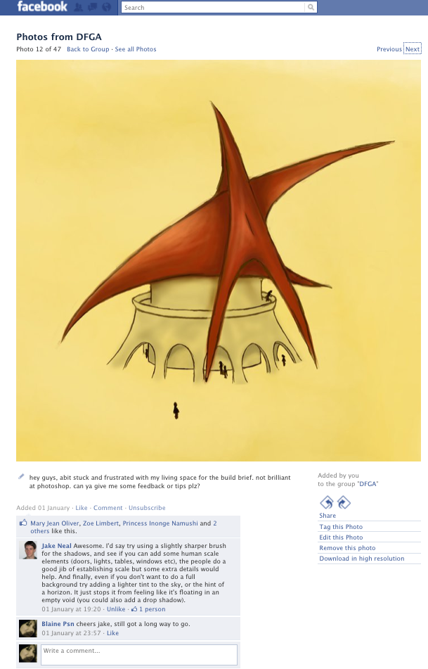
After a brake for a few days i took the feedback on board and continued to work into it. I worked into the lines, access to the building and balcony and tweaked the shadows until I felt happy. I put in people to give a sense of scale and also added some clouds for a sense of height.

PLANS

For my scale model it will need to be spherical so just had a quick look at spherical plans to get a feel of what I will need to draw up.

I will need to add measurements on everything and mine will not be as intricate. But it has given me an idea of what I need to produce. It will be a minimalistic and spacious layout so there is lots of room for movement as it is a busy environment.

Images of my model


Somewhere along the way lines got crossed and I was under the impression for the Build brief we need to build a scale model of our environment. Well turns out we didn’t, so the images are of my almost finished scale model. The only parts missing are the interior walls and computer decks. I did have plans to sketch or makeshift some screen and chairs, but due to the time scale and work load I would only be taking on to much. Hopefully there will be time to finish it off when i have completed the other briefs.

INTERIOR CONCEPT

From my initial thumb nail sketch of the interior I have produce a line drawing using the pen tool in illustrator.To finish the coloring, shading etc I will import it into Photoshop.

unfortunately when i had started to color this image in P a program error occurred which means i am unable to save it. Needless to say this is very frustrating.I think the problem lies in transferring between different versions of Photoshop. I took a screen shot of what I had done.

Obviously it is no where near finished, but it give an idea of the color skeam.

I managed to finish my model. It gives a good idea of how the interior would look. Making the model took longer than it should have, I think this was because I choose a circular design which wasn’t the easiest to build.
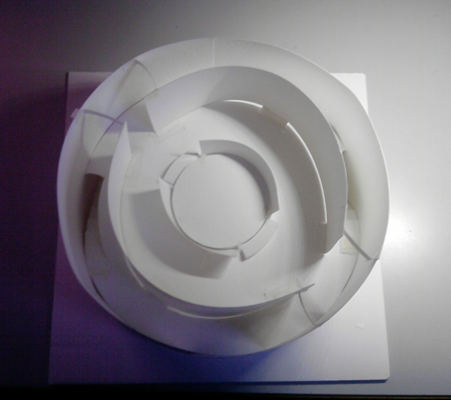
I didn’t really use the right material to make I, but I needed something flexible enough to get a circular shape. The card I used was too flexible, I had to put supportS between the exterior and interior wall to hold the shape. Also the floor lost its shape even with supports underneath.

The floor plan and elevation wasn’t as hard as I thought. It is just visualising realistic measurements and figuring out the scale ratio.

One snowy day (document)

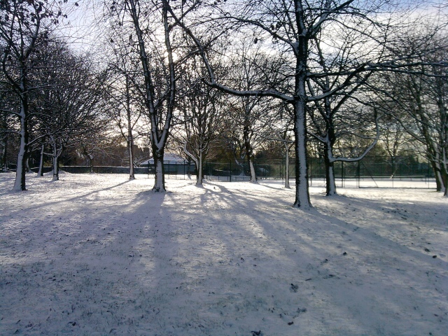
Winter truly is my favorite time of year. After a sudden heavy snow fall everywhere was beautifully covered in white glistening powder.

I took some more pictures with my phone, not the best quality in the world but all I had on me at the time.

The shadows of the trees have a bluish ashy tint on the snow. All the leaves and foot prints look like dimples, little pockets of shade.

Snow has bombarded the side of the trees, impacted by the wind. It looks like the trees have thick black outlines where the snow blows by the curvature of the bark.

You can’t see in the photographs but where the sun hits the snow it looks like tiny shards of glass glistening.

I wanted something on my character to tie in with the city that she lives in. So i decided it would be a color. After experimenting with outfit colors for Nomiki and deciding on black and red, so I looked up different shades and names of red and found Rosso red. I thought that would be a good name for a city and a good color for a building and it will fit with the red tattoos on her arm.


Nomiki

After several hair pulling hours between Illustrator and Photoshop she is finished. I have only made one change from my original idea and that is the extra tattoos on her waist. I originally wanted the tattoos to represent a part of her personality, but after thinking about the type of community she comes from I decided to make them a trait of her program. It is now a mark of the Rosso law enforcement program. Branded at a young age and a symbol of what she is to become and a force not to be reckoned with.

So here is a little about Nomiki.

Nomiki, meaning law, as a child was born into the Rosso Law enforcement breeding program. From birth the are fed and taught to be strong and brave. From the age of 4 the early stages of combat training begins and don’t finished until 18 when they are deemed specialists in their field. They are then put into work protecting the pure citizens of Rosso and ordered to cleans the city and outer regions of ‘dirty civ’s’, people out side the Rosso breeding program the none pure breeds of human. Only following orders she fails to sympathize with the ‘dirty civs’ as she only knows what she has been told by her mentors and friends. She deems her fellow colleges as her family as they are all she has ever known. She is much loved among them and each one would do anything to protect the other. Now aged 20 she is second in command in her precinct and she wont be fully satisfied until she is at the top.

Nomiki is the heroin of the story. Blinded by the tight regulations and teachings of the Rosso government Nomiki saw the ‘dirty civ’s’ as animals, a plague threatening the purity of the city of Rosso. Until one day she was called out to cleans the out skirts of an abandoned sector, in preparation or expanding the city. Upon leaving Ross a small child holding a teddy smiles and waves at her. Nomiki smiles and waves back. In an old apartment store she gives the order clear out the dirty civ’s. Once clear Nomiki likes to sweep the area to make sure things have been done properly under her command. She hears something coming from a toy store. Raising her weapon in anticipation of a Civi, she investigates. There are signs that the cleansing team had already been in there. There are bullet holes in the walls and fluff from stuffed toys in the air and blood on the floor. Turning a corner she sees a tent made from sheets and brooms, riddled with bullet holes. The source of the sound is inside it. Ripping back the sheet underneath is a small girl holding onto her older brothers lifeless body a result of the operation. The girl looks straight at Nomiki, fear and sadness in her eyes. As well as holding onto her brother she has a teddy tightly clenched in her arms. Still looking down the sight of her gun she see’s this teddy in her scope and instantly recalls the girl back a the city. This triggers an emotional response from Nomiki and she fails to see the difference between this child and the one back at the city. Walking away from the girl she begins to question the cleansing methods and the whole government program, leading to her dissmissal and aresst. She is then marked for cleansing, but upon her day of execution, she escapes with the help of her closest colleges. She makes her way to the abandoned sector where she meets Civies. later she calls upon her friends to help the people of Rosso see that these people arn’t a disease and plans to take down the Rosso government.

Just a quick look at other character designs.

This is 9, from the animated movie 9. You can feel he is kind and harmless in his stance and face. I like his simple design, not overly intricate but equally as effective. I need to start of doing simpler character designs.This character is really detailed and its beautiful.Obviously female and a strong warrior. I like that its not draw on typical white paper, the yellow shade It takes the edge off it. Think I will try that myself in the future, it just gives it a little something extra.
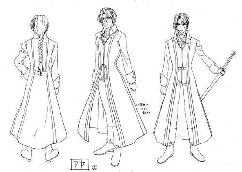
I like the use of green in the shading, it highlights the detail on the characters. I need to think outside of conventional black and white and expand my thinking. I might use a background tint on my character, it gives it a bit of depth and grounding. Places it in a space rather than floating in a white void.